
Registry Feature, The Knot
Designing a delightful registry experience for couples amidst the stress of wedding planning.
Overview
The Knot is a platform that enables users to plan their weddings more seamlessly. Users can build their registries, reach out to vendors, create a timeline of tasks, and more.
The feature enables users to create a registry of wanted items from different vendors. We set out to make this a less confusing, and more delightful experience.

Role
Lead Product Designer
Contribution
Product Design, User Research, User Flows, Wireframes
Team
1 Product manager, 2 engineers, 2 copywriters
Type
Mobile and web app
Tools
Sketch, Usertesting.com
Timeline
2 weeks
// BY THE NUMBERS
1
USER TEST
1
HIGH-FIDELITY
ITERATION
4
LOW-FIDELITY
ITERATIONS
14
% est.*
HIGHER
ENGAGEMENT
ACTIVE KNOT USERS
6,000,000
The Problem
The registry feature wasn't receiving the level of desired engagement. For users, there was confusion around how to use the registry and different vendors to add items to a single list. Their confusion stemmed from not knowing exactly what the feature's capabilities were (what can they add? from where? how do they share?) to the order of steps they were to take to create their own registry. We set out to create a concise and clear flow that was easy to use and increase engagement.
The Solution
A step-by-step flow built around defined user goals which clearly outlined the process for users: which resulted in an est. 14% higher engagement rate.
The Process

// STAKEHOLDER SYNC
Sync
In this first team meeting, we defined our objectives and looked at existing user feedback. What in the current design was working? What were the existing user pain points? We found that users were confused and often would not complete the registry creation process, or go to competitors instead. As a team, we worked together to define user goals as the following: (1) clearly understanding the capabilities of the registry feature, (2) easily add items, and (3) completion. We had to maintain a balance between redesigning the feature for better usability, but also have it feel familiar enough that users wouldn't be lost.
Gather
I gathered any information I had at my disposal: existing user feedback about the current design, design systems in place, and the native design files. With this information, I started to brainstorm designs around user goals.
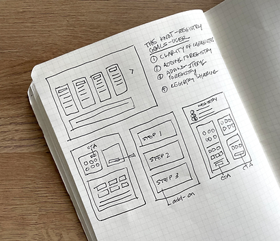
// SKETCH
The main purpose of sketching was to brainstorm. I used our defined user goals to sketch out a few ideas. The main differences between the versions was the segmenting of steps as the user navigated through the registry creation process.
Sketching helped me moved forward by bringing clarity in what flow made the most sense.
// LOW-FIDELITY
I designed some low-fidelity wireframes that were slightly different from one another. These would be used to test with users in the next step. The differences lay in the presentation of their options: a dashboard, or a more step-by-step flow.


Explore Other Projects

// USER TESTING
The Goals
Our objectives were to discover whether any of these designs enabled the user to complete their goals clearly and efficiently. All of our testing scripts were based around gaining clarity around which design did this best. We A/B tested a few different ideas. Design A showcased all the options available to the user, while option B showcased a step-by-step process for users. Some questions we asked users:
(1) How do you feel about this design?
(2) Are your options clear?
(3) Is there any confusion around any of the steps?
User Feedback: Design A
"I wasn't sure where to start but liked that I had options."
" Could I build the registry first and then add a cash fund?"
"I wanted to add things from the Knot registry but should I create one or two separate ones?"
User Feedback: Design B
"The layout made it easy to go step-by-step."
"There was less confusion."
"The step-by-step approach made it easier for me to understand what I could do."
Conclusion
We found that Design B tested better across the board, was easier for users to understand, and provided the exclusive Knot registry as the first step and option.


// HIGH-FIDELITY
I followed the Knot's design system when creating the high-fidelity wireframes. I designed for web. Since we learned in testing that a step-by-step approach was what users enjoyed, that's the design I went with.
// LIVE PROTOTYPE
Here's a look at the live product I designed for web.
// RESULTS & REFLECTIONS
We saw an est. 14% rise in engagement (users creating registries on the Knot).
Looking back, I wish there was a way to have made more time to be more thoughtful about the steps I took in this process.
I learned to adhere closely to the design system requirements with the design we created, and applied everything I learned to my future contracts.
// EXPLORE


