
FAB Feature for Design System, Total Brain, a Sondermind Company
Designing an impactful way for users to engage with Total Brain's core features.
Overview
Total Brain is a mobile and web app that enables users to understand, measure and track their mental health overtime. The platform is centered around assessments that measure brain function across 4 capacities, heart rate variability, and mood. The platform helps users measure all facets of their health, They are given a customized training program that includes meditations, brain games, and exercises focused on growth.

Role
Lead Product Designer
Contribution
User Flows, Wireframes, User Research and Testing, Iconography, Prototyping, Dev Handoff
Type
Main component for design system (mobile, tablet, web), iOS / Android
Team
1 Senior Product Manager, 1 software engineers, 1 UX writer
Tools
Skecth, Figma, Usertesting.com, IIlustrator
Timeline
3 months
// BY THE NUMBERS
2
USER TESTS
2
HIGH-FIDELITY
ITERATIONS
1
LOW-FIDELITY
ITERATIONS
% est.*
HIGHER
ENGAGEMENT
12%
750,000
ACTIVE TOTAL BRAIN USERS
The Problem
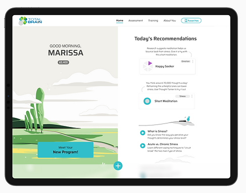
Our team wanted to increase engagement across the app's main features: the assessment, heart rate variability (HRV), and mood tracking. The goal was to create a floating action button that would be. visible throughout the app experience, and was also consistent with our design system (and accessible).
The Solution
I designed a floating action button (FAB) on the home page that gave users an easy path to the features. We saw an up-tick of an est. 12% across all features.

Process Overview
// STAKEHOLDER SYNC
I met with our internal stakeholders: 1 product manager, 1 UX writer, 2 developers and the head of design. We reviewed expectations around timelines, goals, and an agreed upon vision for moving forward. Our goals were to increase engagement across the app's 3 main features.
Gathering
I took a look at any existing research we had, old designs, and any user feedback we had about the current home page and navigation.
I examined our existing personas, and thought about how I could make them more specific to the FAB (floating action button), and looked at our design system to see how I could create icons and interactions that aligned with our guidelines.
Examining old research, we found that users didn't have a clear, linear path to some of these core features. I created feature-specific personas and let that guide me moving forward.
User Journey Mapping
Now that our research had given us some direction, I moved to what a user journey would look like. By journey mapping, I was able to concretely define the purpose of each step and align them with user goals. Users could click on the FAB to be directed to any of the three features, and easily navigate back using the "X" button from them - or simply clicking the HOME icon at the bottom navigation. When I mapped, I figured out 1) how many different flows we need, 2) how they return to the home page, and 3) any error scenarios and edge cases.


//SKETCH
The basis for my sketches came from what we knew to be user pain points. Making the FAB accessible, easy to use, and aligning it with our design system were my goals.
Sketching helped me brainstorm and keep in mind what was important.
I also explored some iconography ideas, and thenmoved from sketches to low-fidelity wireframes.
// LOW FIDELITY
Wireframes
I started with low-fidelity wireframes on Sketch. I made a few different designs. Here is an example of a few.


Iconography Exploration


// HIGH-FIDELITY
I designed high-fidelity wireframes on Sketch for mobile, tablet, and web. We still couldn't definitively decide which of the two designs would work best, so I designed both. Here are a few samples.
Mobile (Native)


Tablet


// PROTOTYPING
I designed a simple prototype to show stakeholders the interactions, as well as for testing. I also designed the mood tracker and assessment segments, shown briefly in this prototype.
// TESTING #2
A/B Testing
We ran several tests comparing icons, colors, interaction styles and labels. Here are two sample designs we tested.
Option A
Option B
While we weren't really testing the background image, users noted they liked the illustration.

While it made it easier to see, users didn't like how dark the background was.

Users enjoyed the color differentiation
& liked the linear expansion
While we weren't really testing the background image, users noted they liked this illustration as well.
Users felt the colors were too similar to what they saw across the app
Clear, concise instructions over a light background / dark text was easier for users to read and understand.
Other Feedback: Verbatim
Without interacting with the prototype, what do you think the blue button does?
"It would give me additional information about measuring my health and stress"
" I think it'll take me to a separate page to do something - take the assessment maybe?"
Click the blue button. Is this what you were expecting to see?
"I thought it would take me to a separate page but I like that you can see the options this way."
"I wasn't expecting this. However, I do think this is quite cool and a unique way of displaying options."
Insights
While a testing environment is not always the most accurate measurement, it's great for getting a sense of direction when it comes to the basics. In our research, we found that users preferred a different color for the menu items, labels in Option B, as well as a more linear expansion of the feature options.
Stakeholder Sync
I amalgamated our research findings and put together a deck to show our stakeholders about my recommendations about how to move forward.
// DEV HANDOFF
Handoff
After I received approval on our designs, it was time t hand off designs to our developers. I notated the flows which explained behaviors. I walked our engineering team through the specs as well to make sure everything was clear. There was no need to make a prototype since we adhered closely to our design system (which I assessed for accessibility as well), and all component behavior was documented and easily available.
Here are a few examples of information I notated:
-
error message handling
-
interactions
-
Accessibility
-
for Android and iOS
-
responsiveness for different screen sizes
-
Differences between functionality on web / mobile / tablet
-
Field usability
// LAUNCH + CONTINUOUS ITERATION
Impact
We launched the new home screen FAB and saw an 11% uptick in engagement with our three core features.
Reflections
While the design got a huge upgrade when considering accessibility, usability, education, and user feedback during testing - we didn't truly get to address the real barriers to higher engagement.
Using Total Brain is often incentivized by a user's employer, and it wasn't within the project scope to address other factors that could have truly been more impactful like: reminders, more hand-holding throughout onboarding and the assessment itself, as well as education for more context (i.e. the answers to "why should I do this?")
Explore Other Projects


