Web Design, Telehealth
A brand new, clean modern look for web.
The Challenge
RelyMD came to me with hopes for a complete redesign of their site.
.jpg)
The Process
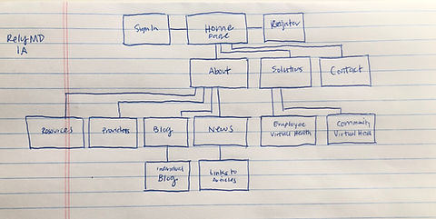
I first started by having discussions with the client. What kind of look were they looking for, and what colors/iconography did they like? They sent me some sites that they liked so I could get a good sense of what they liked. From there, I created a mood board. After that, I created a site map to show the client the new proposed structure of the site. I continued forward with
lo-fi wireframes, and then hi-fidelity mockups. Of course, there was iteration in both phases to make sure I was creating what the client wanted.

Moodboard
I pulled together a mood board to give the client a look and feel of their site.

Wireframing
I created a few different product layouts in my low fidelity wireframes before moving into high-fidelity, and shared them with the client for further feedback.
The Final Product
I chose to create a color palette that was far more engaging than the past one. By engaging, I mean bright, light, and fun. I also changed the structure of the site. Instead of having massive drop down menus and several tabs, I streamlined the sections to scroll, so that users would not have to click into everything. The home page became the centralized data access point. Users could click on topics IF they wanted to learn more. The goal was to not overwhelm users with massive amounts of content, but provide access to information if they wanted to read further (via CTAs).


