
MHELPDESK, PAYMENTS FEATURE
Product Design for Web App

The Challenge
This project focused on the payment processor flow. The existing flow was confusing, hard to set up and follow. I was tasked with creating a more user-friendly experience that was clean, quick, and easy to use. The Mhelpdesk payments logo also needed an upgrade.
The Process
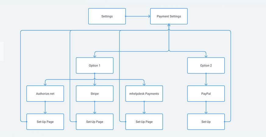
I started by researching some other popular sites and apps in which a user would have to set up a payment flow. What works in the existing marketplace? What can be improved? How are other industry leaders approaching the problem? I researched, brainstormed, and created a site map (below) to ensure a strong IA, and then sketched on paper before moving to lo-fi, and then hi-fidelity mockups.
Low-Fidelity Sample

(Round 1 Mockup)
High-Fidelity Flow


The Solution
I created a user flow that would allow users to easily and quickly enable and set up payment processors of their choice. It was a far more user-friendly experience.