Kiosk, Vibrent Health
Using technology to envision a more accessible form of basic healthcare.
Overview
We set out with the big picture goal of making healthcare more accessible through technology. Our vision was to place kiosks in libraries and other public places to provide people with the opportunity to manage their health without having to go to a doctor's office. The kiosk would enable users to measure key health metrics such as blood oxygen levels, heart rate, blood pressure, weight, brain activity, and body temperature.

Role
1 of 2 lead designers
Contribution
Product Design, User Flows, Wireframes, Iconography
Team
Product manager, creative director, 2 software engineers
Type
App for tablet
Tools
Sketch, llustrator
Timeline
2 weeks
The Problem
The American healthcare system isn't easily available. Instead of finding ways to get people to a doctor's office (which is often not accessible for many Americans)- we thought about bringing access points to them via technology: a kiosk for public places.
The Solution
A kiosk that would enable users to measure key health metrics: blood oxygen levels, heart rate, blood pressure, weight, brain activity, and body temperature. It was later pitched to NIH.

The Process
// SYNC & GATHER
We synced with stakeholders about expectations, timelines (which was two weeks) and requirements. We aligned on expectations of functionality, design, and personas. I asked a lot of questions like: who are we building for? What metrics would we need to measure to effectively assess their health? What kind of budget and time do we have for research, if any? What information do we already have?
We started by gathering medical information that would be central to the project. We talked with our chief medical director to ask about what constitutes health, and what metrics would need to be measured to give our users an accurate baseline. We learned that there were 6 crucial metrics: blood pressure, heart rate, weight, body temperature, brain activity, and blood oxygen level.
// JOURNEY MAPPING
We built around established user goals: (1) protecting their health information, (2) easily being able to take a measurement (3) keep that information for their reference securely.
Given these goals, it made sense to create a linear path with a home dashboard. Users could easily navigate back and forth between one measurement and the next, or alternatively exit if they just wanted to take one measurement. We felt this flow (below) would be best. Each path was for a different measurement.


// SKETCH
After mapping out the user journeys, we proceeded to sketching. Our primary objective for sketching was to generate ideas through brainstorming. We considered questions like: what level of guidance do users require? How can instructions for each measuring device be communicated clearly? And how can we ensure HIPAA compliance?
My co-designer and I came up with several distinct ideas. These ideas differed in terms of the presence of a home dashboard, which measurements users would be prompted to take first (if any), and what would happen if they only wanted to take one measurement.
// LOW FIDELITY
We created both low and high fidelity wireframes on Sketch. We didn't have time to test, but we synced with our team and presented these low-fidelity mockups. Here are some samples.

//HIGH-FIDELITY
Design System
Moving into high-fidelity also meant we'd have to construct a design system for the kiosk. We looked at existing company materials to create a style that was brand cohesive and split the following design work: navigation bars, buttons (play, stop, pause, back, forward), backgrounds, device icons, metric iconography, and more.


Wireframes
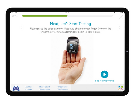
We decided on a flow, look and feel that met our tech requirements, honored user goals, and laid out a clear journey for the user. We built out icons and buttons. We used a visual style that we felt was welcoming (colorful), clean, and light. We followed some material design guidelines and designed for tablet. Here are a few examples.


// USABLE PROTOTYPE
At the end of it all, we had built an incredibly strong, usable product that would allow many to manage their health. The sample shown above is specifically for measuring blood oxygen levels, but this format was followed for the other five devices as well.
//RESULTS & REFLECTIONS
The project was later pitched to NIH, and is currently in development.
Looking back, I wish I had had more time to test, prototype, and deliver a more validated design. I learned to work fast and adapt with the resources and time we were given- and that's a lesson I've carried forward with me ever since.
Explore Other Projects


